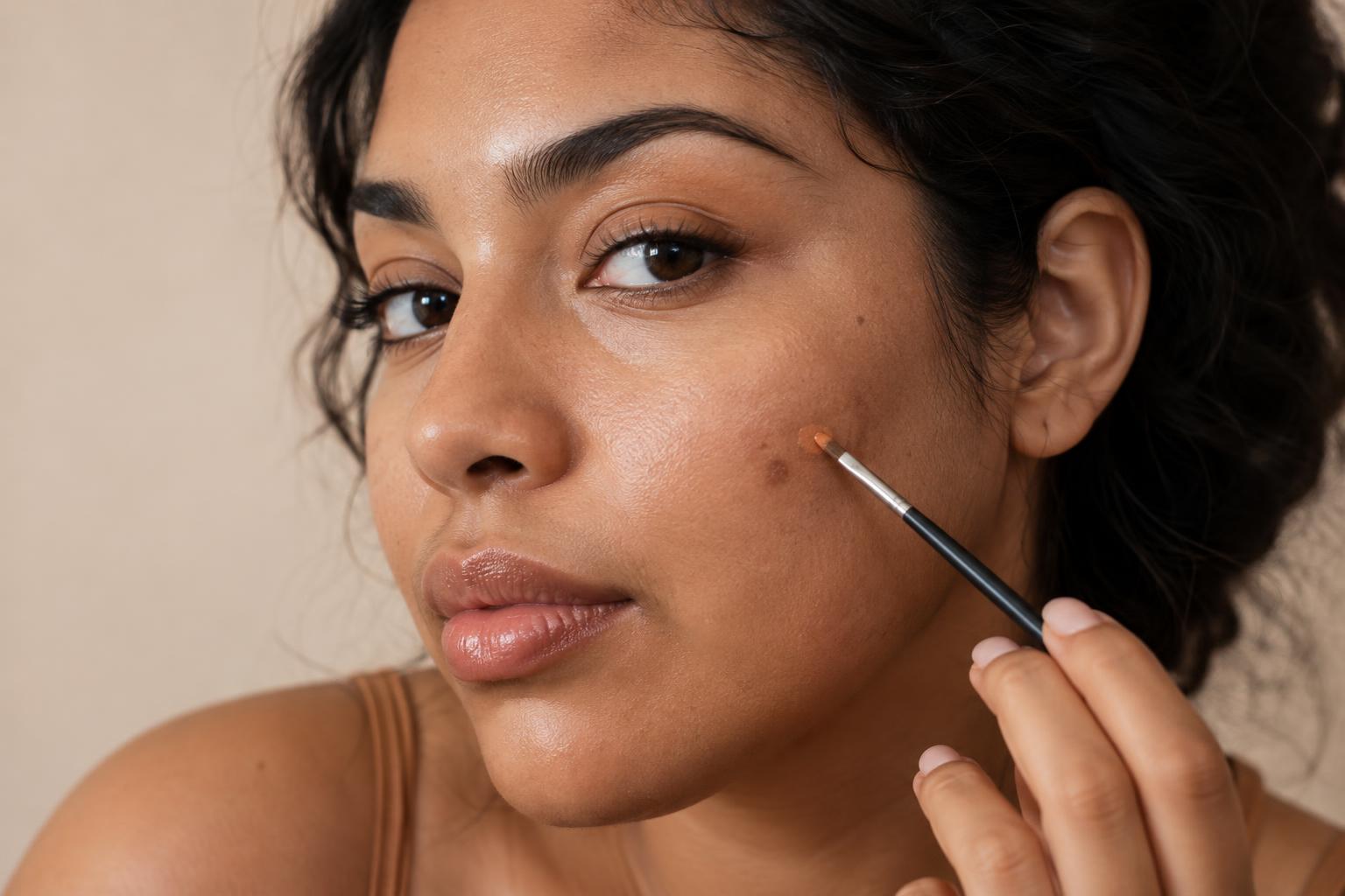
The best color corrector for dark spots on deep skin is usually orange, deep peach, or red-orange—not automatically the brightest red. Choose a shade based on your skin depth and the color of the discoloration, then use the smallest amount that makes your concealer look more even.
A corrector should help your base do less work, not create another layer you need to hide. Here’s how to choose the right shade, pigment strength, and texture, with options across several price tiers.
Peach vs. Orange vs. Red: Which Corrector Do You Need?
Warm correctors can counter the cool, grayish appearance of some discoloration beneath makeup. However, dark spots are not all blue or purple: many look brown, gray-brown, or nearly black. Color-wheel rules are a starting point, not a guarantee.
Deep peach: for softer discoloration
Deep peach can suit the lighter end of deep skin tones or areas with relatively mild discoloration. It introduces warmth without the intensity of a strong orange.
The important word is deep. A pale, pastel peach may leave a light patch on deep skin. If a corrector looks chalky before you add concealer, try a deeper shade rather than piling on more coverage.
Orange: a useful starting point for deep skin
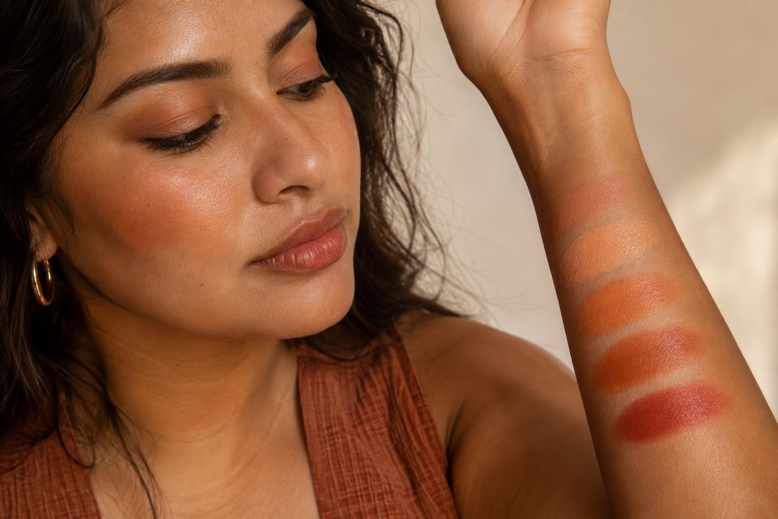
Orange is often a practical first shade to test for visibly cool-looking dark spots on deep skin. It adds more warmth than peach and can help when a skin-matching concealer alone looks gray over discoloration.
Look for an orange that blends into a thin, warm veil rather than an opaque stripe. Soft orange may be enough for subtle spots; deeper, more saturated orange may make more sense for stronger discoloration.
Red-orange or red: for very deep skin and stronger discoloration
Red-orange may be worth testing on very deep skin when orange looks too light or does not sufficiently soften a dark, cool cast. Red is not automatically better simply because skin is deep.
A highly saturated red can show through foundation and require extra coverage. Start with red-orange before moving to true red, and judge the result underneath your usual base—not from the corrector swatch alone.
Match the Corrector to the Spot, Not Just Your Undertone
Your overall undertone helps you choose foundation, but it does not determine every correction shade. Someone with a cool undertone may still need orange over a gray-looking spot.
- Mild brown discoloration: Try a skin-matching concealer first. Correction may be unnecessary.
- Discoloration that looks gray beneath concealer: Test deep peach or orange, depending on your skin depth.
- Strong, cool-looking discoloration on very deep skin: Compare orange with red-orange under the same concealer.
- Several different areas: You may need less pigment around the mouth than on an individual dark spot.
Check the finished makeup in daylight. If the area looks orange, use less corrector or try a less saturated shade. If it looks pale or ashy, the corrector or concealer may be too light.
Compare Pigment Strength and Texture
Pigment: sheer warmth versus concentrated correction
A sheer corrector is easier to spread across a broader area with mild unevenness. A concentrated formula can be more useful for small, pronounced spots because you can place a tiny amount precisely.
More pigment is not necessarily more flattering. The goal is enough warmth to improve the concealer’s result without building a thick patch. Shade depth matters too: a highly pigmented pastel is still a poor match for very deep skin.
Texture: liquid, cream, or stick
- Liquid: Useful for thin layers and broader areas. Start with a small dot rather than covering the entire spot with the applicator.
- Cream: Offers controlled placement and can suit targeted correction. Very emollient layers may move when you blend foundation over them.
- Stick: Convenient for spot work. Pick up product with a small brush instead of dragging the stick across delicate or textured skin.
For dry areas, prioritize a texture that blends without catching on flakes. For oily areas, keep layers thin and test whether your corrector, concealer, and powder work together. Formula category alone does not predict wear.
Color Corrector Picks at Different Price Points
These are editorial options to compare, not firsthand-tested rankings. Price tiers are relative; check current shades, prices, and regional availability before buying.
Budget: L.A. Girl HD PRO.conceal in Orange Corrector
This orange option is a useful starting point when you want targeted warm correction without a premium purchase. Its tube and brush-tip format lets you dispense product, but a separate small brush can offer better control over individual spots.
Choose it if: You want to experiment with orange correction. Begin with a pin-sized amount rather than a full brush stroke.
Budget: e.l.f. Camo Color Corrector in Orange
This liquid-format option is worth considering if you prefer a wand to a squeeze tube. Orange is the more relevant starting shade for many deep complexions; Peach may suit milder discoloration but should be checked for a pale cast.
Choose it if: You like applying small dots and blending them into a thin layer. A large wand swipe can deposit more product than a spot needs.
Midrange: Live Tinted Huestick
Live Tinted’s Huestick offers warm-toned stick options, including Rise, a terracotta shade, and Origin, a red shade. Compare those color directions against your skin and discoloration rather than assuming the red option provides better correction.
Choose it if: You prefer a portable cream stick or want to explore deeper warm shades beyond standard orange.
Premium: Bobbi Brown Skin Corrector Stick
This range is worth exploring if you want more nuanced peach- and bisque-family choices rather than one universal orange. For deep skin, focus on the deeper shades and test them beneath your concealer.
Choose it if: You want to fine-tune shade depth. A premium price does not guarantee a better match, so swatching is especially helpful.
How to Apply Corrector Without a Heavy Finish
- Prep lightly. Let moisturizer and daytime sunscreen settle before makeup.
- Pinpoint the discoloration. Tap a tiny amount directly onto the dark area.
- Soften the edges. Avoid spreading orange onto surrounding even-toned skin.
- Press concealer over it. Use a skin-matching shade for spots, rather than a brightening shade. Tap instead of rubbing.
- Set only as needed. Use a light amount of powder if the layers move or transfer.
Corrector temporarily changes appearance; it does not treat hyperpigmentation. Patch-test unfamiliar products, avoid irritated or broken skin, and seek medical advice for a new or changing spot.
FAQ
Is orange or red corrector better for deep skin?
Orange is often the easier starting point. Red-orange may suit very deep skin with stronger cool-looking discoloration, while true red can be harder to cover. Test beneath your usual concealer.
Why does my corrector look ashy?
It may be too pale, or your concealer may be too light. Try a deeper correction shade and a concealer that matches the surrounding skin instead of adding more product.
Can I wear color corrector without concealer?
A very sheer, well-matched corrector may blend discreetly, but saturated orange and red usually need foundation or concealer over them. If you prefer minimal makeup, try skin-matching concealer alone first.
Should corrector go before or after foundation?
Before foundation is a useful starting method. Apply it only where needed, then press foundation or concealer over it. Avoid sweeping motions that lift or spread the correction.